Jessica Staplehurst's blog
Sunday, 10 April 2011
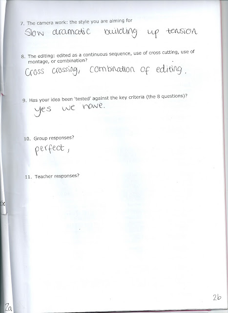
Detailed Treatment Form
Assesment Checklist
Thursday, 7 April 2011
Final Cut Express Effects
The main effect I used throughout the sequence was the colour corrector. This aided us so much in giving the film a professorial look. I looked on youtube for video tutorials on how you can make that "film look". What you do is add the colour corrector effect on the footage. Duplicate the footage so one is ontop. Then on top section click modify>composite mode>overlay. Then go to the bottom footage and put the saturation to 0%.
The effect of this makes the film look almost as if it were a professionally made product.
The effect of this makes the film look almost as if it were a professionally made product.
Garage Band

We used garageband to make the film's soundtrack. We downloaded some music from royalty free sound websites such as http://www.stonewashed.net/sfx.html
All we had to export the final cut project in a .mov and put into the garageband.
Film Production logo

this is our production logo.
Jess, Jade and Chloe edited this in Flash. It the light bulb flashes about two seconds into the moving image.
some names we initially thought of:
Wonky Donkey Productions
Lighthouse Productions
Newhouse Productions
Light bulb Productions
Transform Productions
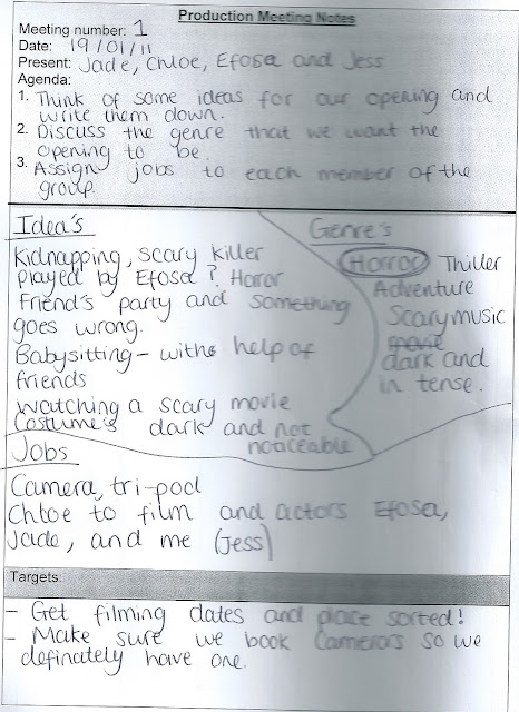
Production Meeting Notes 2

Production Meeting Notes

Idea behind Opening Sequence
We chose the horror type genre because Miss Thrasher said it would be easier for sixth form students to make it look more presentable. Genres such as Comedy are hard to film effectively and it's easy for it to look cheesy and not funny.
Are original idea was more of a thriller than a horror but we scrapped that idea because we were running out of time and wanted an easier sequence to plan and film
Are original idea was more of a thriller than a horror but we scrapped that idea because we were running out of time and wanted an easier sequence to plan and film
Problems the group faced
Some problems that we as a group faced was that other than Jade and Chloe we didn't really live that close to eachother. So we couldn't just go to each others house that easily. Also as the deadlines for year 13 are on the same days as ours + year 11 lessons it was always going to be hard to find a free computer for us to edit on.
In fact this was our main problem in my opinion. One way we could have countered this problem would have been to export our film home and edit there. But none of us had macs at home so even that would have been hard also
In fact this was our main problem in my opinion. One way we could have countered this problem would have been to export our film home and edit there. But none of us had macs at home so even that would have been hard also
Rough Copy of our Opening Sequence
This is our rough working copy of our opening sequence. It's about 60% finished and we needed to make a couple more edits and cuts and basically upload all of our sound.
Preliminary Sequence
This is our preliminary sequence. Chloe filmed most of it and I did most of the editing. We didn't really plan any of the dialogue because we were focusing more on the variety of shots and meeting the criteria
Mise-en-scene
- Is a french term meaning what is put into a scene or frame.
- It's made up of visual information in front of the camera.
- communicates essential information to the audience about setting(time and place) and characters
1)setting and props
2)costume,hair and make up
3)facial expressions and body language
4)lighting and colour
5)positioning of characters/objects within the frame
Setting and props
- Settings and locations play an important part in film-making and are not just backgrounds
- Sets are either built from scratch or a great deal of time is spent to find a setting which already exists
- Settings can manipulate an audience by building certain expectations and the taking of a different turn
Costume, Hair and Make Up
- Tell us immediately whether the film is set in the present and what society or culture it will pertain to.
- Acts as an indicator to the audience of a characters' personality, status and job
- certain costumes can signify certain individuals( e.g black cloak of a vampire) or groups( men in uniform)
Facial Expressions and Body Language
- Provide clear indicator of how someone is feeling
- If someone is smiling broadly, we assume they are happy but we may have got a different feeling if this was accompanied with scary themed music
- Body language may also indicate how a character feels towards another character or may reflect the state of their relationship
Original Film Title
We originally thought of calling the film "The Hiding". Because Efosa was meant to the be the hidden killer but we changed the title to Captured as it has a double meaning. Captured as in Efosa eventually capturing Jess. And captured as in the photography sense when Efosa takes a picture of Jess at the end of our opening sequence.
Final Cut Express Cuts
I've made numerous cuts since the film showcase. I've cut nearly every section of footage to give the film an overall cleaner look. The transitions are now cleaner and it makes more sense now.
The first cut I made was the length of time where the lipstick drips onto Jess' picture. It used to be 10 seconds,now it's about 5 seconds. It might seem minuscule but it's quite effective in the long run.
The first cut I made was the length of time where the lipstick drips onto Jess' picture. It used to be 10 seconds,now it's about 5 seconds. It might seem minuscule but it's quite effective in the long run.
Miss Thrasher's notes on film showcase
Positive
Ethereal effect
Don't see Efosa's face till end
Mise-en-scene well thought out
Negative
too much effect in some areas
Jade's foot stomp needs reworking or cutting
credits need to re-done
dialogue
too much boring walking
I took these on board and made a lot of cuts and edits that make the film look a lot more professorial and has a cleaner look overall.
Film Showcase Feedback
The last question from the feedback sheet."Did you notice any serious issues such as continuity errors, strange edits - Did anything not make sense to you?"
- "Storyline was a tad confusing but knew roughly what was going on. Maybe sharpen some of the shots a bit."
- "Sound needs a bit of work. Didn't get the bit with the train."
- "Some bits are too dark, can't see as well."
- "Camera shots are slightly jumpy."
We read these over and took everything they said into consideration
Feedback from Showcase Part 2
"Who do you think the target audience is?"
The above comments show that to an extent we have succeeded in staying relevant to the genre. Even though we hadn't finished editing our film, people could already see how it's of the horror genre
"Who do you think the target audience is?"
- "16+"
- "Mainstream"
- "People who like horror"
- "15+"
The above comments show that to an extent we have succeeded in staying relevant to the genre. Even though we hadn't finished editing our film, people could already see how it's of the horror genre
Film Showcase
The class held a showcase lesson where each group showed off what they've done so far. We handed out sheet for our classmates to fill out which helped us find out what we needed to finish.
The first question we asked was "What was especially good about the film?"
The first question we asked was "What was especially good about the film?"
- "Really good editing- Red lipstick with black and white shot and good camera work and use of sound."
- "The camera work was really good. Good use of colour. Lighting was very good."
- "Never see the face till the end. Good shots of the knife. Shots of make-up and nail varnish at the start were really good."
- Lighting suits the genre. Good acting
Representation in Media notes-6
Representation in Media notes-5
Representation in Media notes-4
Representation in Media notes-3
Truth or Lies
Media representations are a very political issue as the influence of media exerts a major impact on the way we view the world.
Gender and Media Representation
Gender is the basic way we use to sort out human beings. Essential elements of our own identity and the identities we assume other people to have, come from the concepts of gender.
Many objects, not just humans are represented by the media as being masculine or feminine. Mainly in advertising as we’ve grown up with those connotations.
Typically masculine: Tough, hard and sweaty
Typical feminine: Fragile, soft and fragrant
Representation in Media notes-2
Extension/Restriction of experience of reality
By giving audiences information, media texts extend experience of reality.
Watching documentaries about political events/historical events extends your experience on reality. Producers of the media have selected the information we receive, which means our experience is restricted.
We only see the edits they make, not the actuality of the situation.
Representation in Media notes-1
Representation in Media
Media texts are re-presentations of reality. They produce different versions of what is perceived. Every single media form is representation of somebody else’s concept.
Without media our perception of reality would be limited as we need media to make sense of our reality.
Representation is a fluid two-way process: producers produce the text, and the audience deciphers the meaning.
Wednesday, 6 April 2011
Zombieland-Opening Sequence
http://openingsequences.blogspot.com/2011/01/zombieland.html
the video is not working so here is the link.
the video is not working so here is the link.
Opening conventions- The films starts off with a shot of the american flag and the national anthem of USA being played. The shot rotates and we see the flag was actually upside down and it's on what looks like one of the president's cars. This shows that the world has been turned upside down and everyone and everything is manic.
Narrative Function- The function of the narrator is to explain what is going on in zombie land and almost give a satirical how-to on surviving the treacheries of living in zombie-land. This is relevant to the genre because it takes away the audience from the situation and adds funny commentary to things that shouldn't be funny. As a comedy this is the aim. If it were a horror film the chances of having a voice-over here would be less.
Characters- You cannot see any main characters from this opening sequence. You can see people getting eaten, thrown out of cars and beaten up. But the main characters remain to be seen. The audience could assume that the narrator will be one of the main characters because he's the only voice we can hear so far.
Film Lang- MES, Cinematography, (Light and Sound)- The appearance of the whole sequence is manic. There are overturned bins, damaged buildings, and debris all over the place. The use of non-diegetic sound takes the audience away from the scenes which put more emphasis on the voiceover. The narrator has a calm,slow and controlled voice, which is in contrast to the crazy surroundings.
Film Lang- Movement, framing, Editing and Sound- The credits and titles constantly get destroyed by the zombies and the people getting chased. The music is very contra-puntal as it doesn't reflect the attacks,killings and chases taking place. The slow motion makes everything dramatic and bold. You can see the very little movements in people's facial expressions as they run for their lives. This adds towards the comedic value.
Jaws-Opening Sequence
http://openingsequences.blogspot.com/2011/01/jaws.html
Opening conventions- The opening sequence starts off with the "Universal" ident and then the it then "a Zanack/Brown" production. Then the camera angle is the POV of a shark travelling through the water. The credits are now directly in the middle of the screen and fading out as the shark goes on almost as if the shark is eating up the cast
Narrative Function- There is no narrator in this opening sequence and I think it's better that way as it makes the whole sequence more authentic and the lack of non-diegetic sound makes sure the audience is not taken away from the film. This is key as the suspense needs to built leading up to the shark attack. And hearing a voice over would reduce that impact.
Characters- There are 3 main characters in this sequence. The first two were the boy and girl that run away to the shores from the rest of the group. We know that they are the main characters because the shot stopped moving and focused in on them(the boy especially). The last character is the shark itself and we never get to see it. This is relevant to the genre as many horror films do no show the "villain" clearly and rely on the audience to build their own perception on how scary the villain actually is.
Film Lang- MES, Cinematography, (Light and Sound)- The lighting is quite low key at the start with the use of natural light coming from the campfire. You can also see the use of a key light to amplify the effect of the natural light . Then a filler light is used to soften the harsh shadows the key light creates. The moment where the girl enters the water the sunset is in clear view which implies that something bad is about to happen. Also the whole colour scheme of the sequence changes into dark colours as they run from the campfire the shore. This again show the impending doom as the dark colours bear the connotation of something bad or mysterious.
Film Lang- Movement, framing, Editing and Sound- The camera follows the two of them up until the girl gets into the water. This is very important the following of the couple increases the expectation of something happening to them. There are a lot of underwater shots and shark POV shots which puts the viewer in the eye of the shark. The now famous Jaws soundtrack just increases the suspense as the audience knows the girl is going to get attacked.
Opening Sequences-Cleaner
Opening conventions- The film starts off with an indent and then the credits play over the scene. The camera zooms in after every scene change. This entices the audience as there's an element of uncertainty present. The music played is initially is quite demure and morbid. Then the element of contrapuntal music is used when the jazzy tune is played.
Narrative Function-The role of Samuel L Jackson being the narrator is to describe what his is and what is basically going on. On the contrary to the job he is actually supposed to be doing(cleaning up dead bodies) his voice is quite upbeat and cheerful. It's almost as if he is very indifferent to the situation he's in. Which is a quality he needs in a job like this. The interesting part of this narration is that he's reveals as the main character at the opening sequence
Characters- There aren't many characters at all in this opening sequence. We can already see that Samuel L Jackson as the cleaner is obviously the main character. Other than him we can see the woman whose just witnessed her dead in her kitchen. After that there are cameos of dead bodies, funeral attendee etc. Then we see the flabbergasted woman at the end. Samuel L Jackson is supposed to be the narrator but we can see shots of him during the opening sequence as the cleaner. This is non-diegetic sound but at the end of the whole sequence it becomes diegetic as he starts talking to a group of people.
Film Lang- MES, Cinematography, (Light and Sound)- Throughout the opening sequence the colours primarily used are greys, blues and blacks. These colours are not associated with happiness and positive feelings. But the music and the narrator's voice tone doesn't reflect that. There is hardly any on -screen sound and it's overshadowed by the narrator and the music. This takes the audience away from the scenes and brings the narrator closer to audience.Most of the scenes contain a lot of shadow with a little bit of light. This can emphasis the fact that it's a depressing, demure profession but this film is portraying it in a satire kind of way.
Film Lang- Movement, framing, Editing and Sound- The camera zooms out throughout nearly every scene, showing a bit more of the surrounding with each zoom. The titles and credits appear on rooftops and on other surfaces. This makes the titles sequence more unique.
Subscribe to:
Comments (Atom)


